Publishing House Rebranding
Client
Tools
Overview
More (Море) is a Bulgarian publishing house with over 20 years of experience creating crosswords, logic puzzles, and educational books for children. Their name “More” means “sea,” but their true spirit is about curiosity, challenge, and joyful learning.
I led a complete rebrand of More publishing, from brand strategy and tone of voice to visual identity and print design. The aim was to modernize the brand, unify its presence across formats, and appeal to a wide audience — from logic-loving adults to playful young readers.
Where we started
Before the rebranding, the brand faced several consistency and identity issues:
- Multiple versions of the logo were being used across print and digital platforms, often with mismatched colors and styles
- Visuals leaned heavily on literal sea themes, feeling outdated and inflexible
- No clear system for differentiating between adult and children’s editions
- Overall tone felt too corporate or serious — lacking the warmth and cleverness of the content itself
- Packaging and covers varied significantly, weakening brand recognition
Designing a new identity
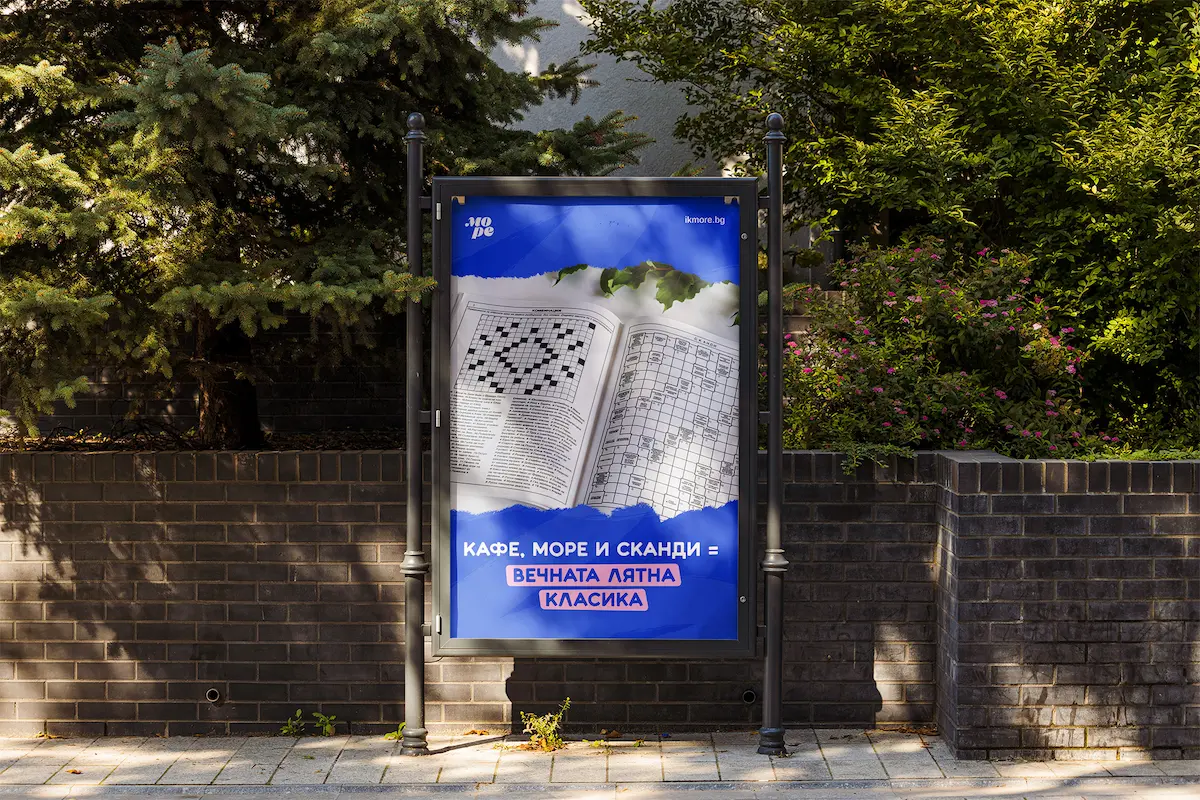
I developed a brand system built on contrast: logic and play, tradition and imagination, clarity and color. The result is a friendly, flexible design that stays grounded in the publishing world but feels alive and modern.
Key elements included:
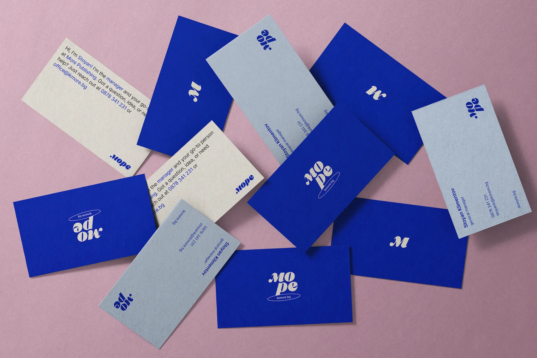
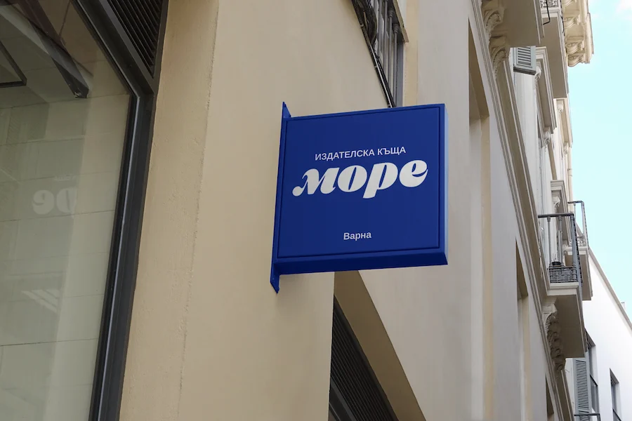
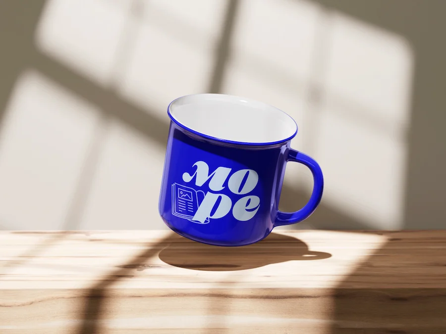
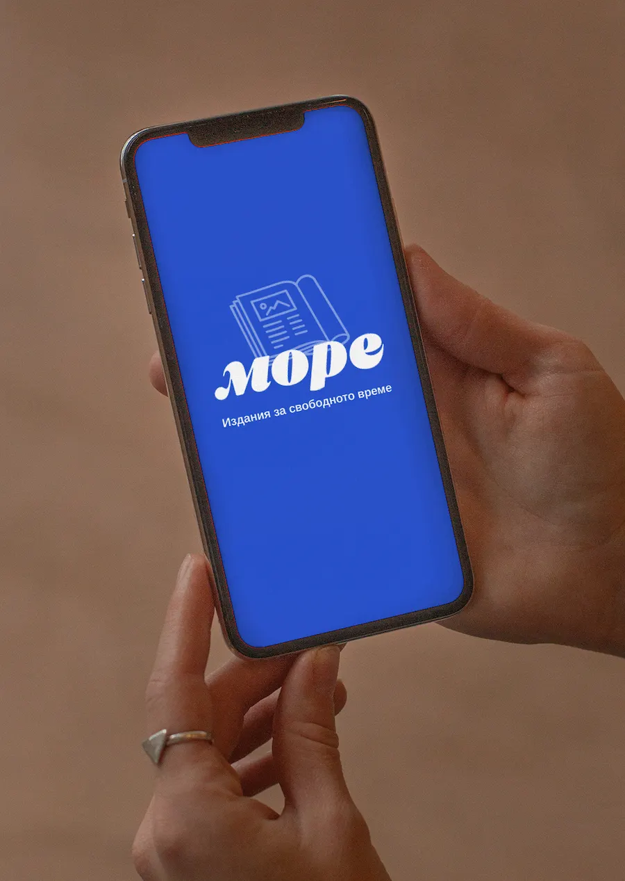
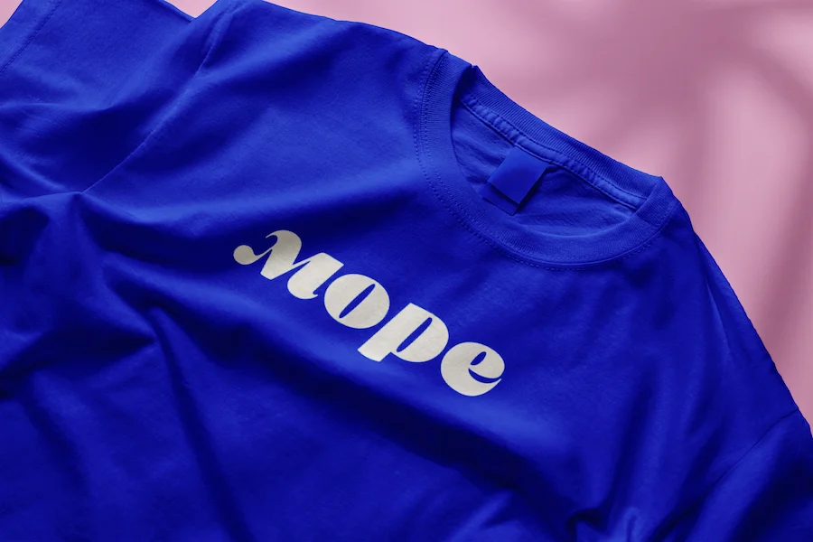
- Logo redesign: geometric yet playful, with a custom wordmark and flexible puzzle-inspired icon
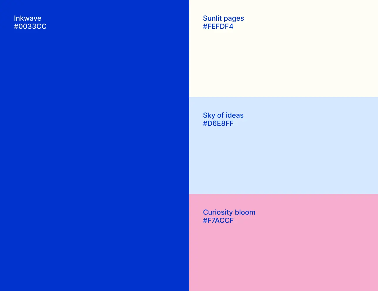
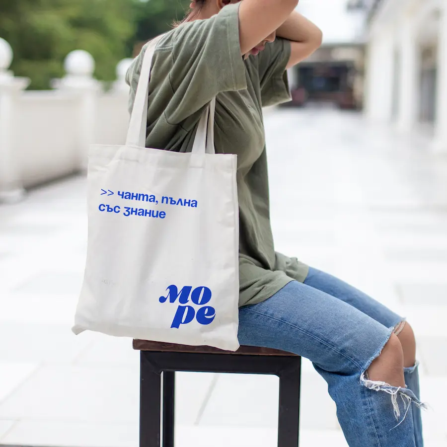
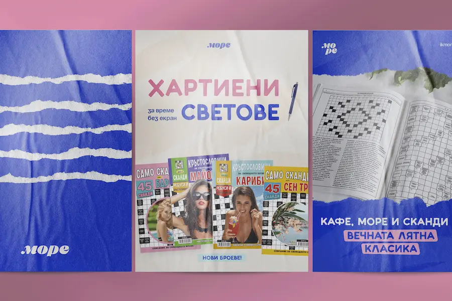
- Color palette: nods to the sea (deep blues, sun-washed sand) with warm pink accents
- Typography: clean sans-serif with just enough character — readable, modern, and multilingual
- Tone of voice: clever, engaging, and warm — suitable for packaging, ads, and social captions
- Layout & product system: clear, consistent design language adaptable across print and digital formats
Impact
- Clear visual and verbal consistency across print and digital platforms
- Stronger recognition from B2B partners (distributors, bookstores, educational institutions)
- New partnerships forming monthly, attributed to clearer brand presentation and professional packaging
- Unified system allows the internal team to scale production efficiently and cohesively
- A cohesive look and feel now ties together puzzle books, activity sets, and new product formats
Highlights
- Custom logo with multiple layout variations
- Full identity system
- Print-ready design structure for multiple audience types
- Clear tone of voice for future campaigns
- Practical templates for scalable print and digital rollout
Next steps
With the rebrand in place and applied across their most recent editions, IK More is now preparing to expand its presence digitally. The next phase includes a refreshed website, better digital catalogs for partners, and a potential move into interactive formats and online distribution.
